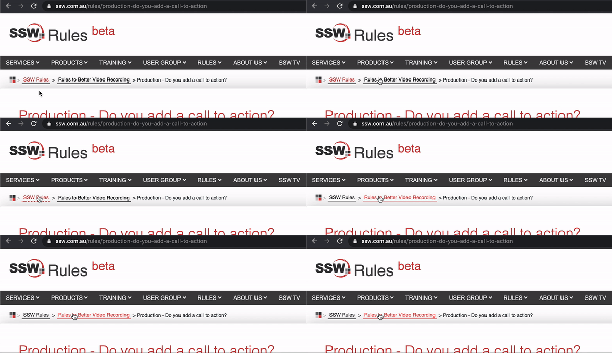
Ensure your links are easily distinguishable from the background and surrounding text by always making them underlined. Users expect underlined texts to be a link; and links to be underlined.
Note: Underlines are not necessary on obvious links, like menu/breadcrumb items or buttons. On the other hand, hover effect (see more below) should always exist.
For more information on this, please go to SSW website.
Figure: Good example - The link is nice and clear
Tip: You can use a different color on underlines as a nice touch.
Never underline a text that isn't a link
Use bold or another styling if you need emphasis.
When you develop on SharePoint, you do not have a full copy of web.config in your Visual Studio project.
Figure: Bad example - Never underline the text when it isn't a link
When you develop on SharePoint, you do not have a full copy of web.config in your Visual Studio project.
Figure: Good example - Using bold for emphasis
Include a hovering effect
Rollovers are also important as they offer visual feedback to a user that this link that will take them somewhere. While there is a myriad of ways to do this; color change is recommended because it preserves text readability. Hover the good example above to see this working.
The basic CSS for changing the link color on hover is:
a:hover {
    color: #cc4141;
}
Avoid other effects on hover for text
Effects like bold, scaling, rotation, or background changes can distort text, making it harder for users to read and interact with links.

Note: These effects may be used for buttons or other non-text content elements.
Avoid replacing underlines with borders
The default implementation of underlines in CSS is:
text-decoration: underline;Another way to add look-alike underlines is by adding border-bottom: 1px;, for example. In this case, you can even have a dotted underline. However, it's not recommended you use this method unless you are a designer and know what you are doing. It may create extra pixels in the interface, which can potentially cause other problems in your UI:


