
Do you know the best practices around colour?
Last updated by Brady Stroud [SSW] 10 months ago.See historyUsing colour in reports can bring them to life, or else make them confusing and noisy, so make sure youre intentional with them.
Semantic colours
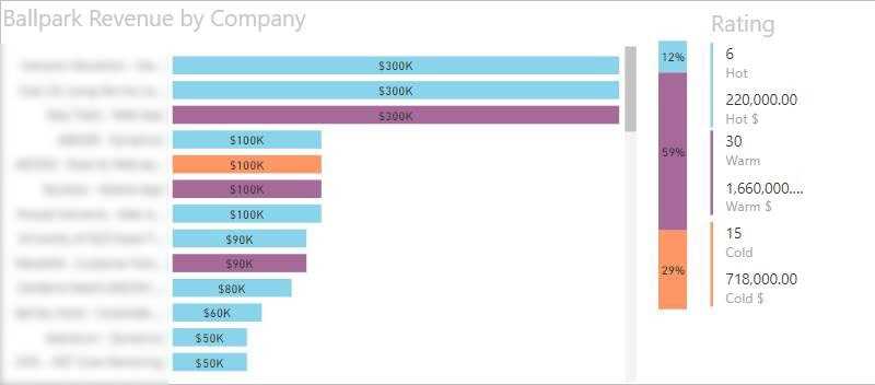
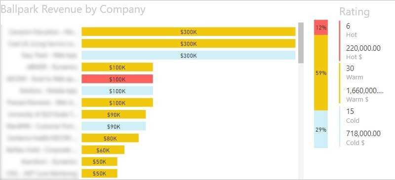
Remember that some colours have a shared understanding of their meaning:
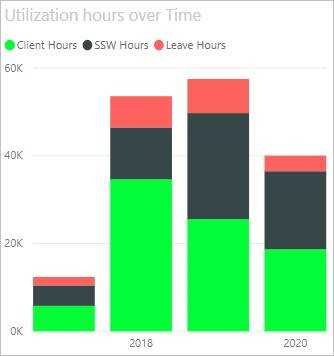
- Red means pay attention or danger
- Green often means good
- Traffic lights can be used for showing 3 levels
- Cold, Warm, Hot should have appropriate colours that make sense without having to look at the legend
Tufte minimalism
Edward Tufte is often quoted as saying that, on a report where you want to draw the eye to exceptions or out of bounds data, colour should only be used to highlight what you want the user to see.
Consistent Palette
Make sure you stick with one colour palette, so if you use one pastel colour, make them all pastel. If you have one bold colour, make them all bold

Colour Blind palette
Just to be difficult, it is worth noting that red/green colour blindness is the most common type, which may make standard semantic colours sometimes less desirable. In this case, use blues and oranges for contrast instead.
